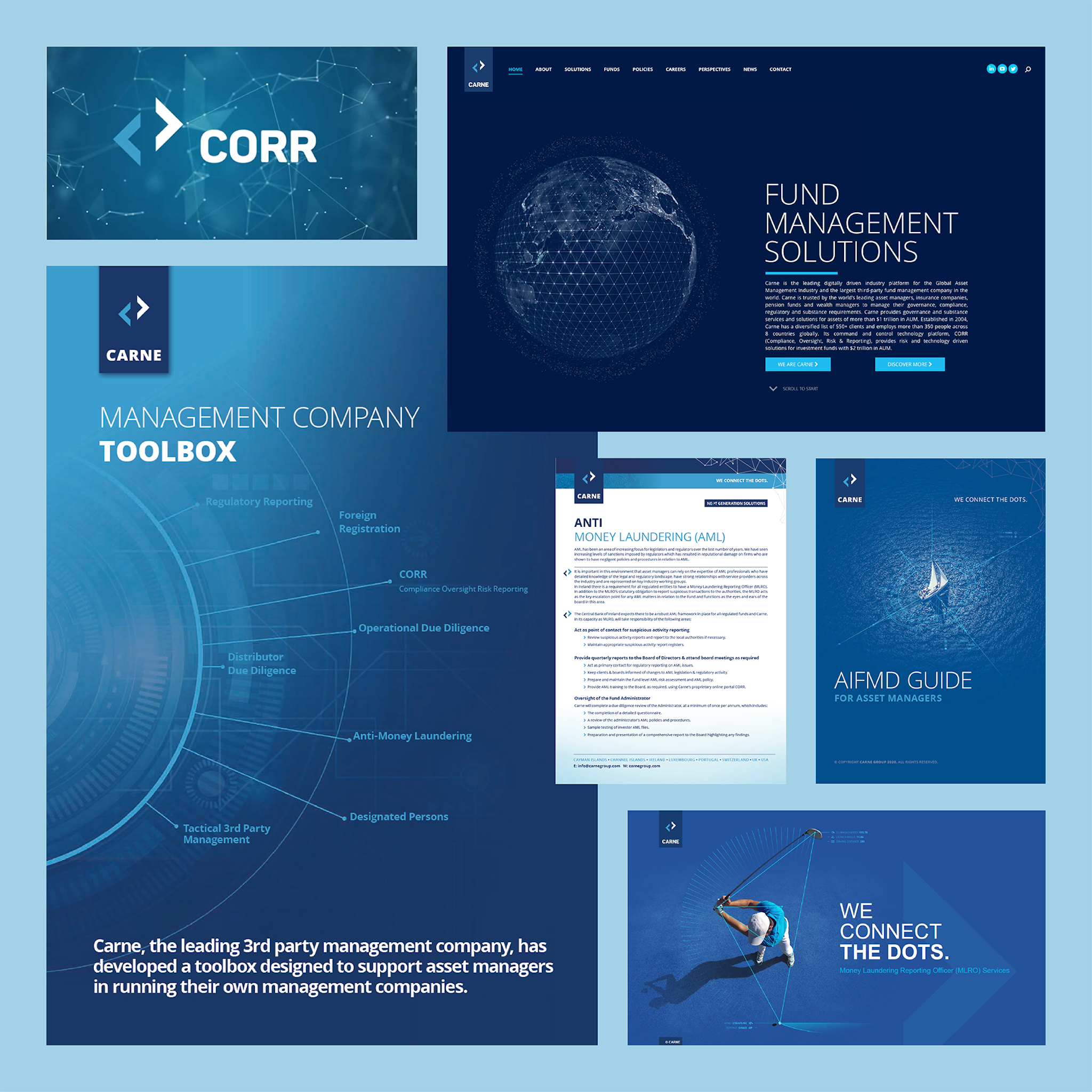
Previous brand
Lacking clarity and distinctiveness, the previous brand did little to set Carne apart – putting them at risk of missing out on major opportunities to grow market share. Our research revealed that the Carne brand was lost among many other blue brands and was failing to resonate emotionally, making it indistinguishable in the market.
Root and branch research
Identifying opportunities
Our sector research uncovered a risk-averse industry with a very dry, corporate approach to branding. Carne was lost in a sea of blue, having trodden a similar path visually as the great majority of the sector: clichéd metaphors such as connectivity, bridges, and navigation-based imagery. At the same time, we mapped out what the target audience needed to feel to make a favourable decision: trust was hard won and vital. Great news in many ways. We knew we could give Carne the tools to be both different and more reassuring.


Where asset management comes together
The core idea
The biggest pain points for Carne’s audience are keeping on top of fragmented regulations and the fear of making a mistake in a world of great complexity. The core brand idea addresses these issues head on. Carne uses technology and knowledge to be a unifying and simplifying force, the place “Where asset management comes together”. “Unity through simplicity” became the core of the brand and guided every aspect of its evolution. Both visually and verbally, the brand continually reinforces themes of connection, unity and togetherness.

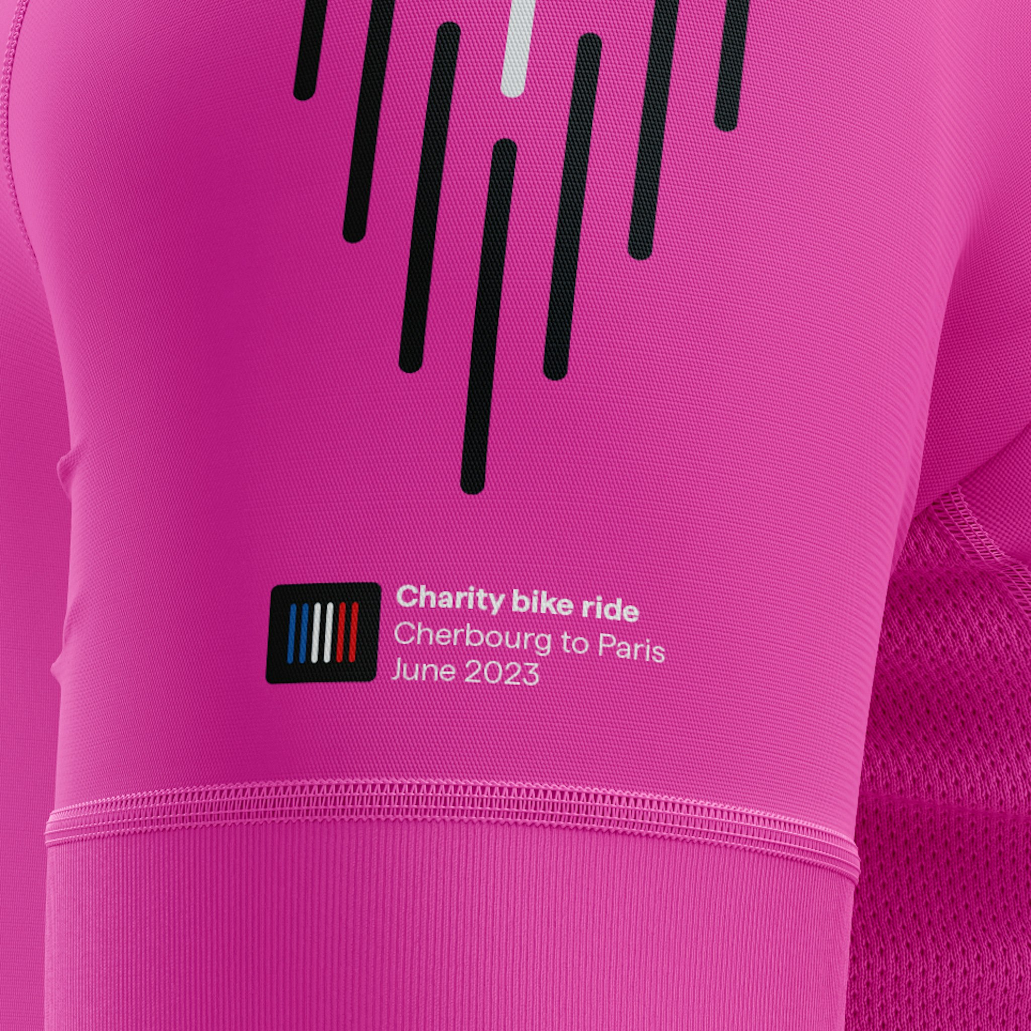
Language of lines
A limitless expression for the brand
The building block of the visual identity is the simplest way to unite two points – a line. This is a brand that moves, like data and information moves, but in a way that avoids the data cliches that abound. In the Carne visual language things are always moving together, to reflect unity. The line language is flexible, extending from simple icons through to dynamic animation.

A new strategy for products
From confusion to clarity
We organised 40 products into a more manageable architecture of three distinct branded “service lines”, allowing Carne to quickly direct the conversation to different audiences, making every word focused and relevant. It also allowed employees and clients an immediate grasp of the history, business proposition and the vision. Overwhelming became calm, organised and reassuring.

Renaming the digital platform
A more human, beneficial story
The technology platform CORR (a complicated acronym) was renamed Curator, instantly communicating how Carne’s clients are in total control of their fund operations – from the big picture to granular detail.

Marketing
Speaking the client’s language
We shaped Carne’s voice to be proactively reassuring – reframing potential clients’ emotions from “daunted,” “confused,” “overwhelmed,” and “wary” into confidence and clarity. In a risk-averse industry, we identified exactly what people needed to feel at each point of their journey of engagement, weighting our language accordingly. We then rigorously back-checked every sentence against two key criteria: Is it simple? Is it unifying? The resulting tone builds trust and speaks directly to client needs.


Internal morale
Seeding togetherness
We built values to preserve Carne’s bright culture: thoughtfulness, togetherness and bounce, and values to guide the adjustments required by the new strategy: discipline and tenacity. Each value set out clear expectations of both employee and employer… and what this meant for the client experience.


Environments
Designing a seamless experience
We partnered with an architecture firm to create cohesive branding across their Dublin and Luxembourg headquarters – and later expanded the concept to offices in the Cayman Islands, Germany, Switzerland, London and Jersey. Central to every space was the line language, manifested in textured wall finishes, privacy glazing for meeting rooms and inspiring posters. This consistent application ensured a seamless brand experience across all locations.


2025: brand evolution
The brand adapts to a change in strategy
In 2025, as the industry’s seismic shift towards outsourcing gathered pace, Carne refocused on its core strength: third-party management. The brand evolved to match the new strategy, emphasising people and partnership with a warmer, more human look introduced to mark Carne’s 21st anniversary.


Client feedback
I have been through global rebrands with both Barclays and JP Morgan, and I have to say that the processes followed, the thinking and the standard of work here are far beyond what I witnessed on those projects. How you have merged the business with the culture, future aspirations and strategy is without precedent in my experience.”
Mike O'Brien
Non-executive Director